
How Proctopal replaced a data dump with a dashboard people can act on
In short
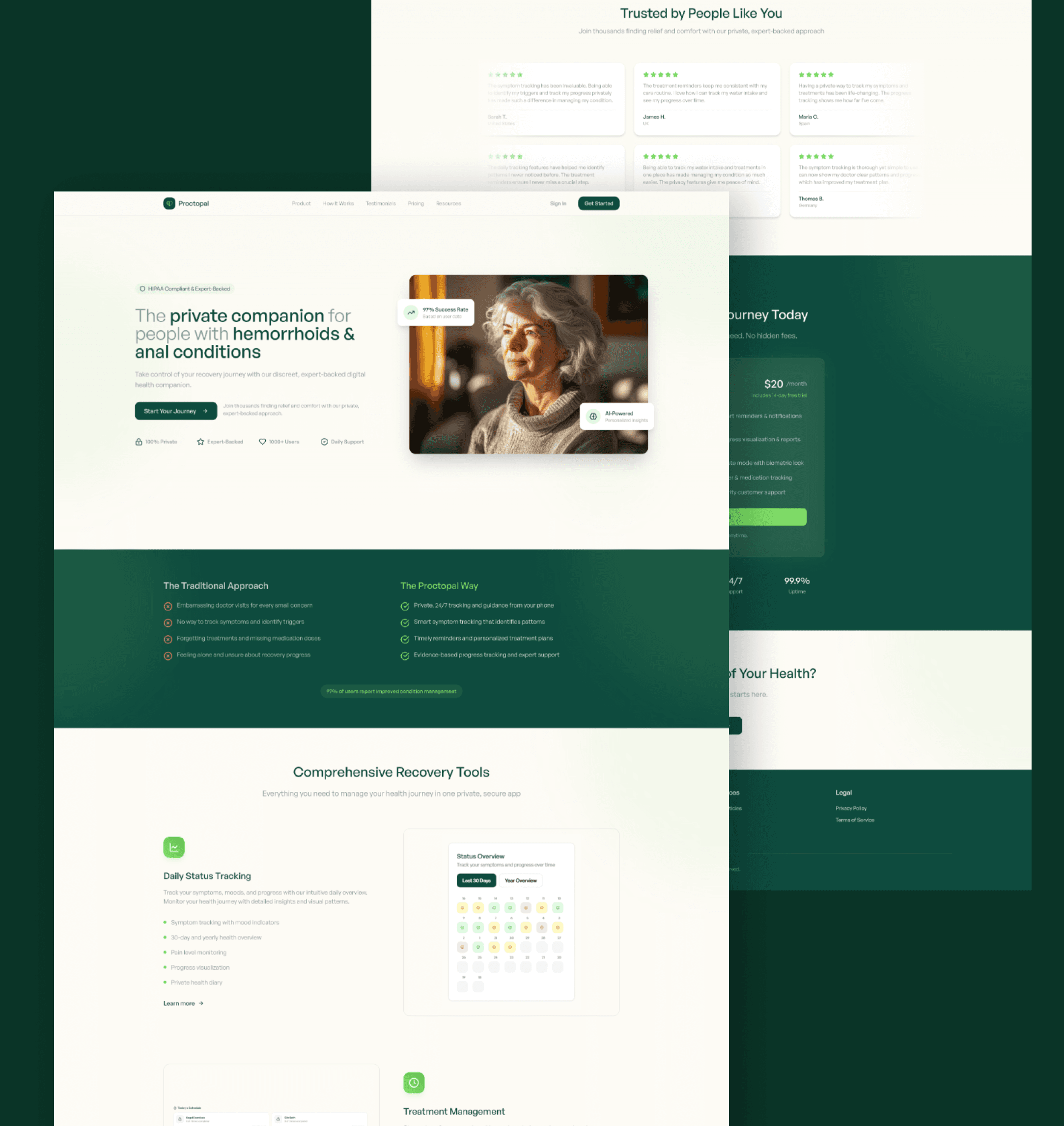
Proctopal is a health platform that helps users track and act on their data. The original interface buried useful insights under raw clinical detail and lost users during onboarding. Orkkid redesigned the interface around a card-based dashboard, guided onboarding, plain-language insights and an accessibility-first build to WCAG standards.
- Client
- Proctopal
- Industry
- Healthcare Platform
- Services
- UI design, UX research, Frontend development
- Built with
- Next.js, React, TypeScript, Tailwind CSS
- Period
- Interface redesign, 2024
- Live site
- proctopal.com
Where Proctopal started
Proctopal is a health platform that helps users track and act on their data. The previous interface buried the most useful insights under raw clinical detail, which created a steep learning curve and high drop-off in onboarding. We redesigned the interface from scratch around clarity and guided action.
The work, step by step
- 01
Card-based dashboard
The most relevant health metrics surface first, in plain language. The deeper data is one click away, not the front door.
- 02
Guided onboarding
A short, personalised onboarding flow that adapts to the user's stated health goals and skips what is not relevant.
- 03
Plain-language insights
Recommendations are written in everyday language with the underlying data available on demand. No jargon as the default state.
- 04
Accessibility-first build
Built to WCAG standards from the start: high contrast, clear typography, keyboard navigation, screen-reader friendly structure.
What changed for Proctopal
- A first-run experience that does not require a manual
- Dashboard that prioritises action over data dump
- Plain-English recommendations instead of raw clinical detail
- Interface that holds up under accessibility and regulatory expectations
The lessons that transfer to your business
Surface the decision, not the data
Users do not want every metric; they want to know what to do next. Leading with the action and keeping the detail one click away cut the learning curve without hiding anything.
Accessibility is a design constraint, not a compliance step
Building to WCAG from the first wireframe produced a cleaner interface for everyone, and a product that holds up under health-sector scrutiny.
Frequently asked
What was the problem with the original Proctopal interface?+
Useful insights were buried under raw clinical detail, creating a steep learning curve and high drop-off during onboarding. Users could see everything and act on nothing.
What did the redesign deliver?+
A card-based dashboard that surfaces the most relevant metrics first, guided onboarding personalised to the user's goals, plain-language recommendations with data on demand, and an accessibility-first build to WCAG standards.
Find out if AI recommends your business, and what it would take.
Free AI visibility audit: the real questions your customers ask, tested across ChatGPT, Perplexity and Google AI, with the businesses currently winning them.